5 easy ways to make your menu more accessible

Creating accessible menus for your restaurant, bar, cafe or venue isn’t just a good idea – it’s a must. The more accessible your menu is, the more likely you are to sell items and boost revenue. You can adopt a few practices to increase the accessibility of your menu, so strap in and join us as we run through them.
Add dietary filters and tags
We’ve already discussed the need for dietary and allergen tags on your digital menu. But hey, we don’t expect you to be superfans and read everything we publish, so we’ll sum it up again (please read everything we do from now on, though).
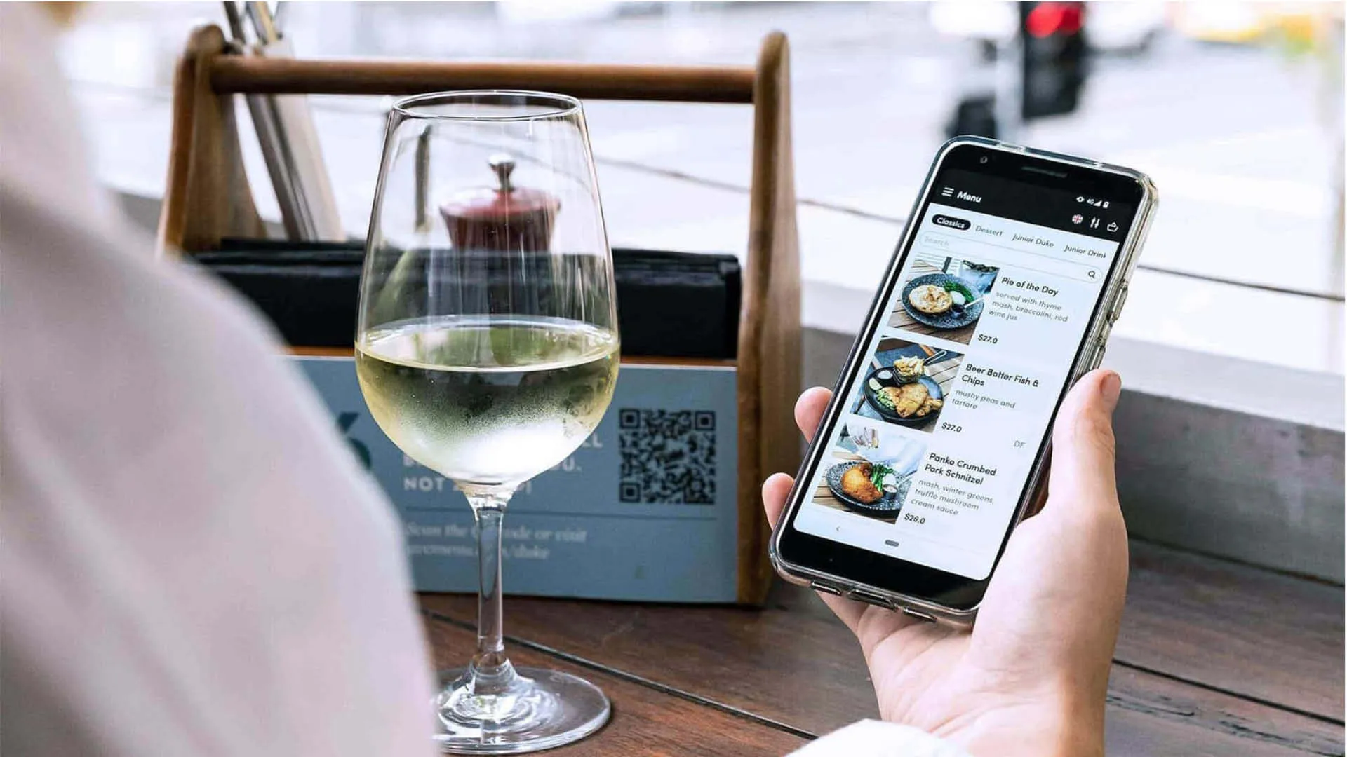
Having your menu filterable based on dietary preferences is not only super easy to do with a digital menu, it also does the heavy lifting for you when it comes to selling your menu items.
Customers looking for specific meals or drinks based on a dietary requirement or preferences don’t need more barriers to purchase. Keeping things easy to find at the click of a button or with a quick scan makes the dining experience better for everyone.
Promote your top sellers
With a digital menu, you can easily add popular tags to the items you want to promote, or your customers are most likely to order.
This allows your customers to quickly scan the menu and see what your venue’s top dishes or drinks are. Tags are particularly handy if your venue has a special dish or drink that you know will bring people back for more.
Tags also help users who don’t want to read the full menu. Maybe the conversation is popping off, or their date had misleading profile pics, and they want to eat ASAP and split (we’ve all been there) – in those instances, a quick game’s a good game and an absolute accessibility victory.
Show us what you got
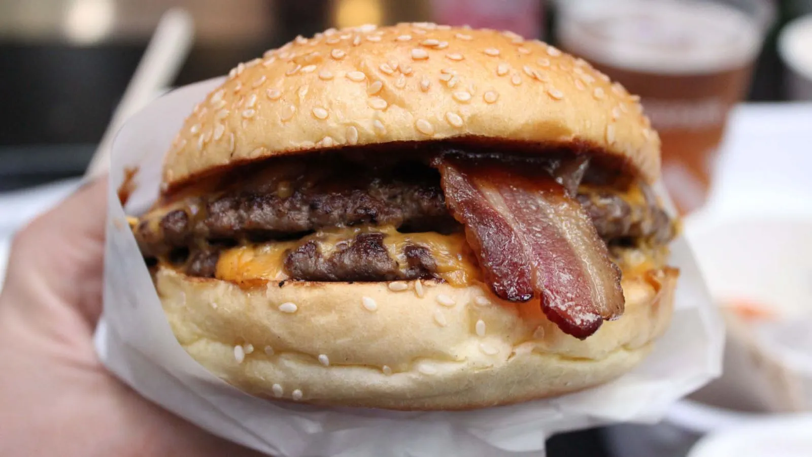
Food photography isn’t just for Instagram and visual menus aren’t just for fast food joints. Showing off your food and drinks helps with accessibility and stops one of the worst possible feelings when dining out – food envy.
Digital visual menus allow you to showcase your offering with professional photography so guests can get a real sense of what they’re about to order. Whether they’re keen on sussing portion sizes, how many olives you put in your dirty martinis, or they just absorb information better visually – having pictures is an easy way to increase accessibility and ensure order happiness.
Menu categories
Digital menus can easily be categorised in the same way you might expect to find a physical menu (unless you want calamari on the wine list, you do you). Aside from the usual categorisation of drinks, entree, main and dessert – you can go further and customise categories on the fly to suit your needs and the needs of your guests.
For instance, if it’s a scorching hot day outside, you could add a frozen cocktails section to your menu. Formatting based on your customer’s needs is, as you have probably guessed by now, great for accessibility.
Categories help take the guesswork out of the ordering process, and your guests can jump to the sections that best represent what they’re in the mood for.
Bilingual menus
It’s handy if your menu can speak more languages than one. And that’s especially true if you’re looking at using digital menus. There’s no need to print multiple versions of the same menu when users can simply select an option that translates it all for them.
For instance, me&u comes with five available languages for easy translation: Spanish, French, Chinese, Greek and Italian – so you can access more customers without digging out your old French textbook. Plus, you can fine-tune the translations if they need a little more tailoring. Molto bene!


